

 “We could hardly get through Mauve, Part I,” some might say. Not a popular hue.
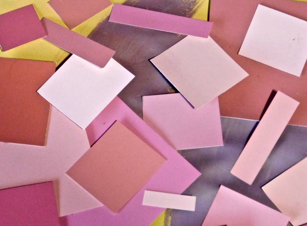
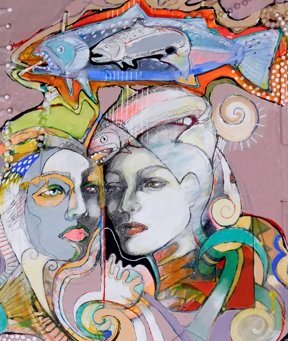
Some call mauve a neutral. It is a mud pink to a shadowy faded purple. I’ll share a few paintings of the 12-piece “mauve” color-study series. It is not a color I would normally use — only for this article study purpose.
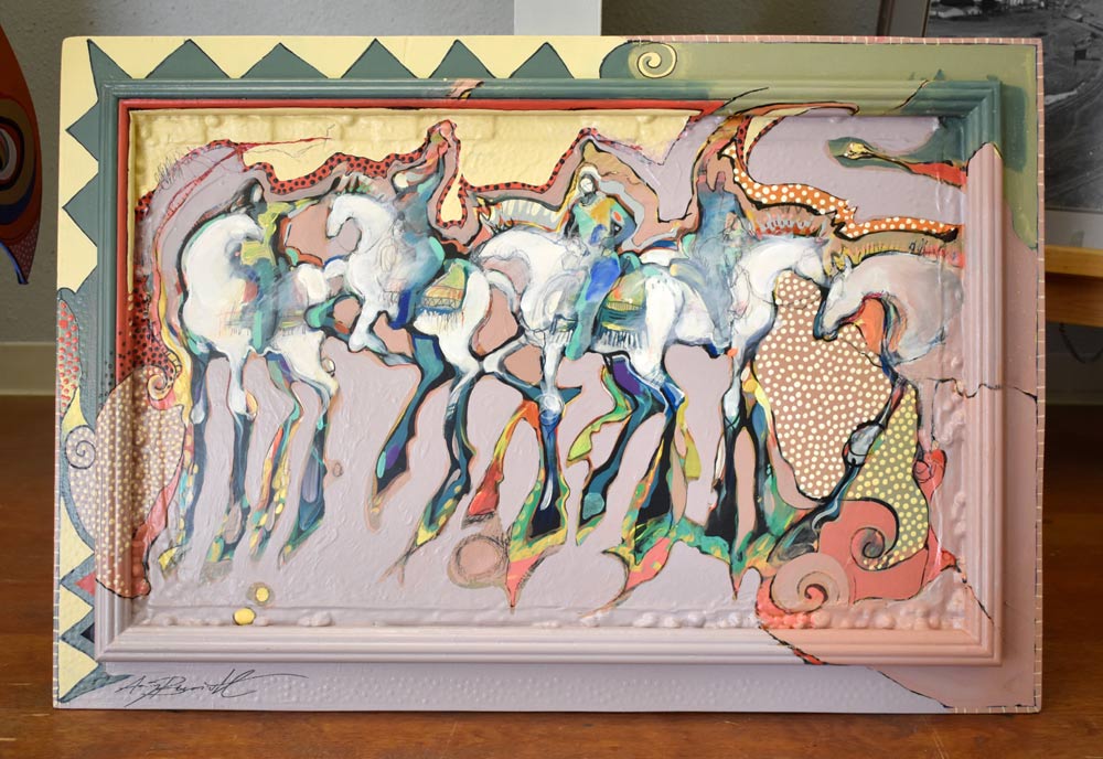
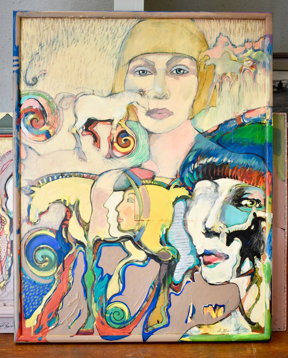
“Winter’s Last Pony Trail” is a large, horizontal painting with multilayers of paint and added pieces, always experimenting. Even the round, lower tactile protrusions are just old beads from the Moeller Jewelry that were glued on and painted over and over.
I mixed my own colors, so mauve varied, sometimes too much to the purple side and other times creeping over to the salmon shade. Academically, it is a great painting, but the color seems annoying, a bit suffocating. An artist friend said he really liked the painting, even though it was flat and emotionally absorbing.
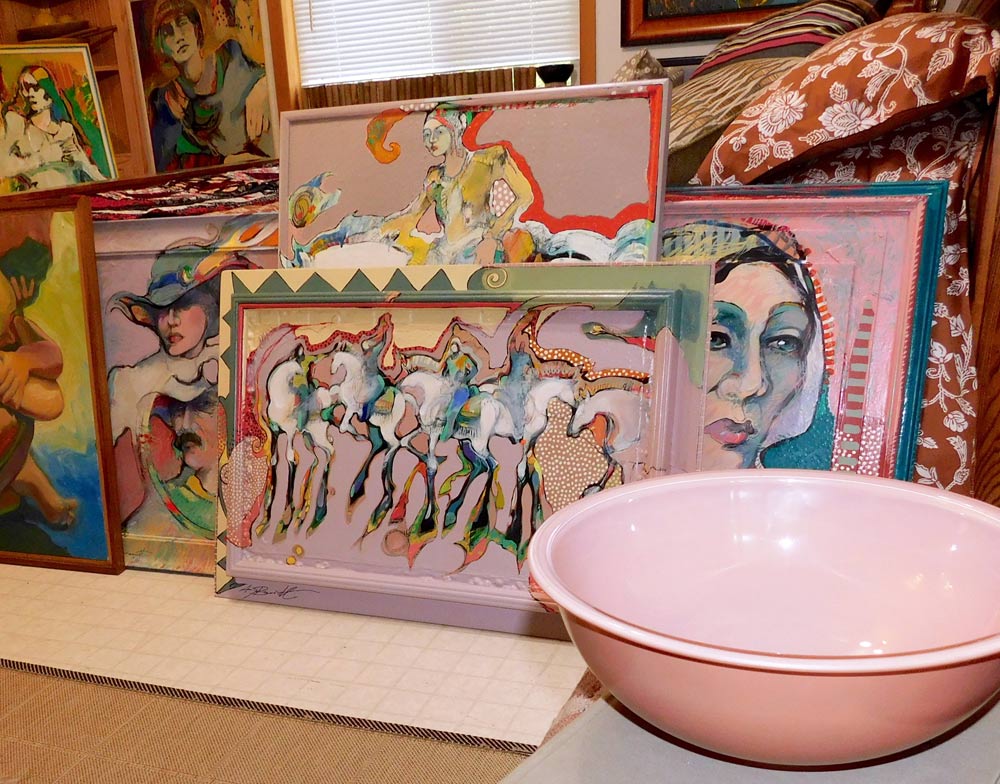 The other painting is titled “Remembering My Horse.” It is hard to see mauve in this painting. Originally, I lightly sanded an old existing painting, and applied mauve to the surface. Then began painting over mauve.
Neutral trends seem to span 10-year periods, swinging from the tans to the grays. We are way into the grays. I have to wonder where the everything-gray road will lead — tilting to warmer beiges or transforming into a rosier neutral like mauve?
It didn’t take long to realize that the color mauve had some kind of mysterious power. Its neutral, unassuming presence is quite deceiving, as it can draw one into its web with a quiet deliberateness.
With some dozen color/study articles under my belt, I’ve got the format down — paint, research and interview — but mauve had a mind of its own.
Mixing paint was the first step, but something happened, as its definition and appearance varied, and the color values and shades jumped all over the place. The ingredients were white, blue, red, yellow and black to get that warm and faded mud-purple paint. Too much yellow, and a salmon color might appear, or adding just a few too many drops of ultramarine blue, and vivid purple pops out.
I also began gathering unfinished paintings or paintings from my rejection pile and lightly sanding them. Then I applied the prepared paint to up to 75 percent of each painting. From there, it began.
I painted and painted and painted, mixing and applying one mauve layer after another, usually continuing with the original painting theme and subject. The cool yet warm hue had captivated me. I completed a dozen large major paintings in a sixth-month period.
A good color study includes interviews with interior designers, architects and florists, and visits to furniture stores, thrift shops and paint departments. It wasn’t happening, as I was so engrossed putting paint to paper that “Mauve Part I” mainly consisted of painting.
The second part began with a visit to Zech Interiors & Design in Belfair. Tammie Zech has been my “go-to” for many years, as has Arnold’s Home Furnishings on Kitsap Way in Bremerton. This color mauve was not to be found. Zech, who has many years of experience in numerous design and construction directions, shook her head. “I’ve worked with the color as an occasional wall neutral,” she said, “but not much else.”
Before talking to anyone at Arnold’s, I walked around the showroom. But where was mauve? Even in fabric samples, no mauve. Colleen Taust stretched to find close-samples. In the past, interior designer Cate Adams always helped me with color trends, but this time she also shook her head.
“Can it be a custom order?” I asked. Adams smiled and said, “It’s probably not even at the factory.”
The folks at the HUB, a thrift shop in Belfair, also help me with the latest trends and insights into who is donating and buying vintage what. Lest for a sweater and two mauve color plates, that was it!
For the most part, I would get funny looks just mentioning the word mauve, a word most throw in the basket with ’70s gold and olive green, and ’80s mud-pastels.
Besides the visuals, music has been a big factor in my life. Best friend Rhonda Stewart is the manager for Mark Lewis, an internationally recognized jazz musician. I want to associate mauve with music and Lewis, also a visual artist, readily applied mauve to jazz expression.
 Musician and country songwriter Nyle Hartley considers himself to be a wordsmith. I agree. He is a musician’s musician who laughingly said, “Hard to fit or rhyme the word mauve in a country song.”
In Part I article, I used the word “awful” when talking about mauve. But now, a love affair of sorts, as the mud-pink-pale-lavender became my friend. Maybe nowhere else in the world, but in my large art studio, the color was everywhere — on most art surfaces, in every paint container, splattered on the floor and in paint affixed to work aprons and shirts.
I probably asked a hundred people what they thought of mauve. Most were surprised I was mentioning the rarely spoken word, but I was surprised that they liked the odd mud-pink. Many actually loved the color. But then I have to ask, “Why isn’t the color more prevalent in today’s interior design or apparel?”
Interestingly, as I talked to folks about the color, probably the most-asked question was, what color goes with it? Some remembered the vintage pastel era where the color-mate was pastel blue, and a few liked the thought of pale mauve walls with a midcentury-modern setting.
Personally, it is a puzzle. Mauve really is awful, but it will hook you. I think the discomfort is because we are not used to seeing the so-called vintage hue these days.
Gray has dominated the stage for a long time. Maybe it is time for gray to change or at least move over — become warmer or move to a different cool, like mauve.


 Litter Free")


Comments