


 Jumping in and getting stuck in the mud, that’s how I feel about this color. It is hard to even name it. I like “rust” the best, but when folks are asked about the color, I get an odd look as they slightly wince, raise a shoulder, tilt their head to one side and say, “Rust?”
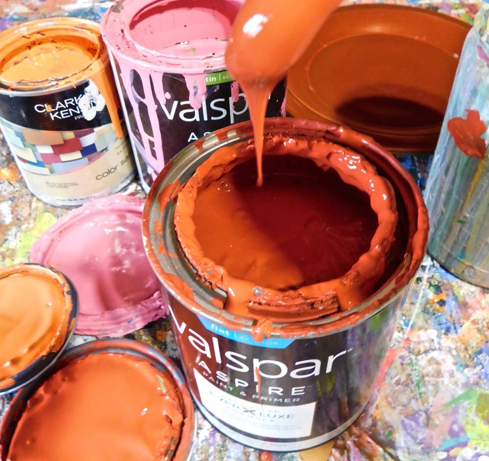
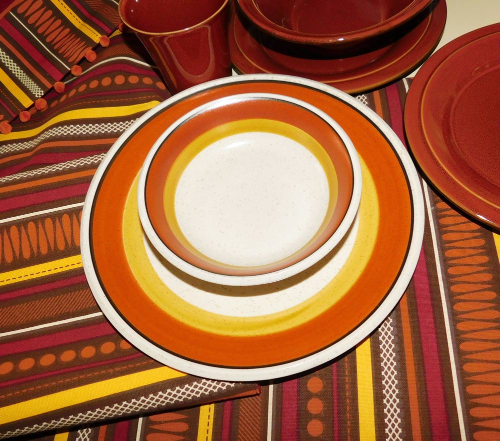
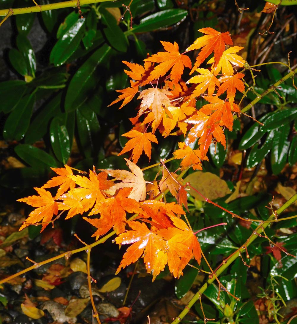
Maybe I should have said brick, burnt orange or the many other paint-store titles like Monte Carlo, Spicy Paprika, Saffron Spice, Red Maple, Heart of Rome — it goes on and on. Simply, there’s a range between burnt orange and burgundy, a color frequently used but seldom thought about, like the elephant in the room.
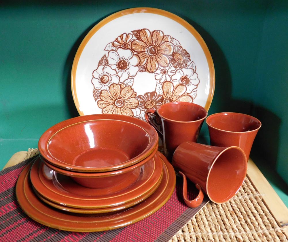
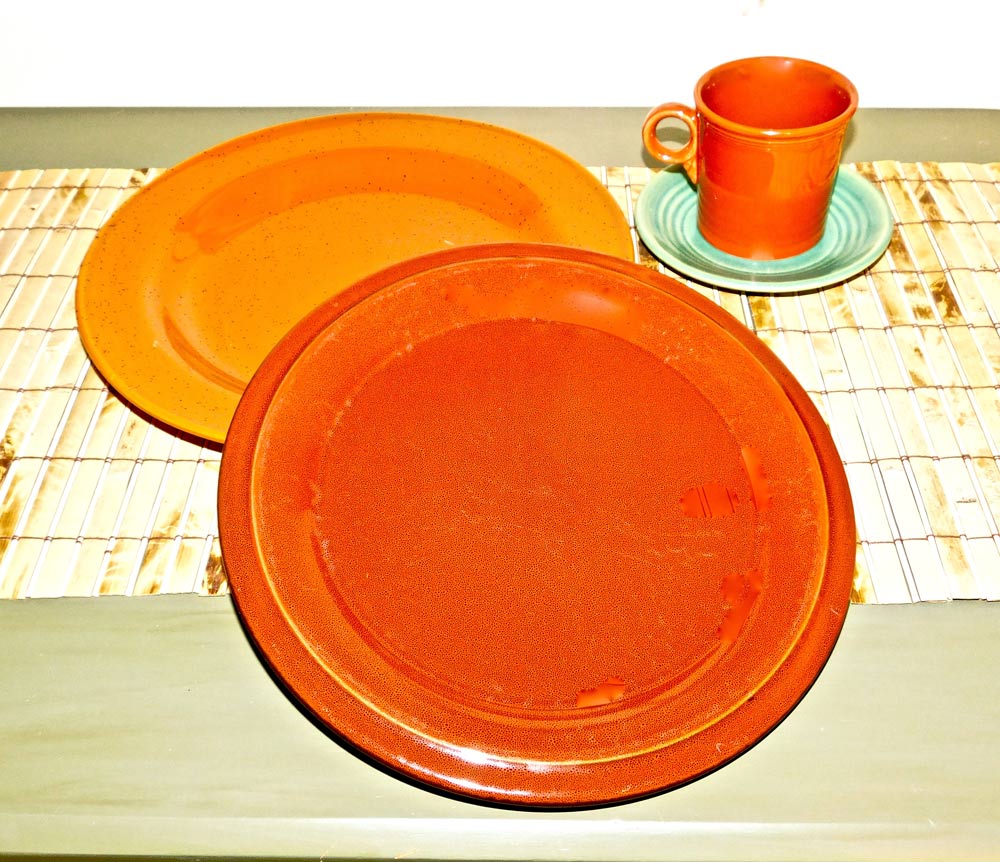
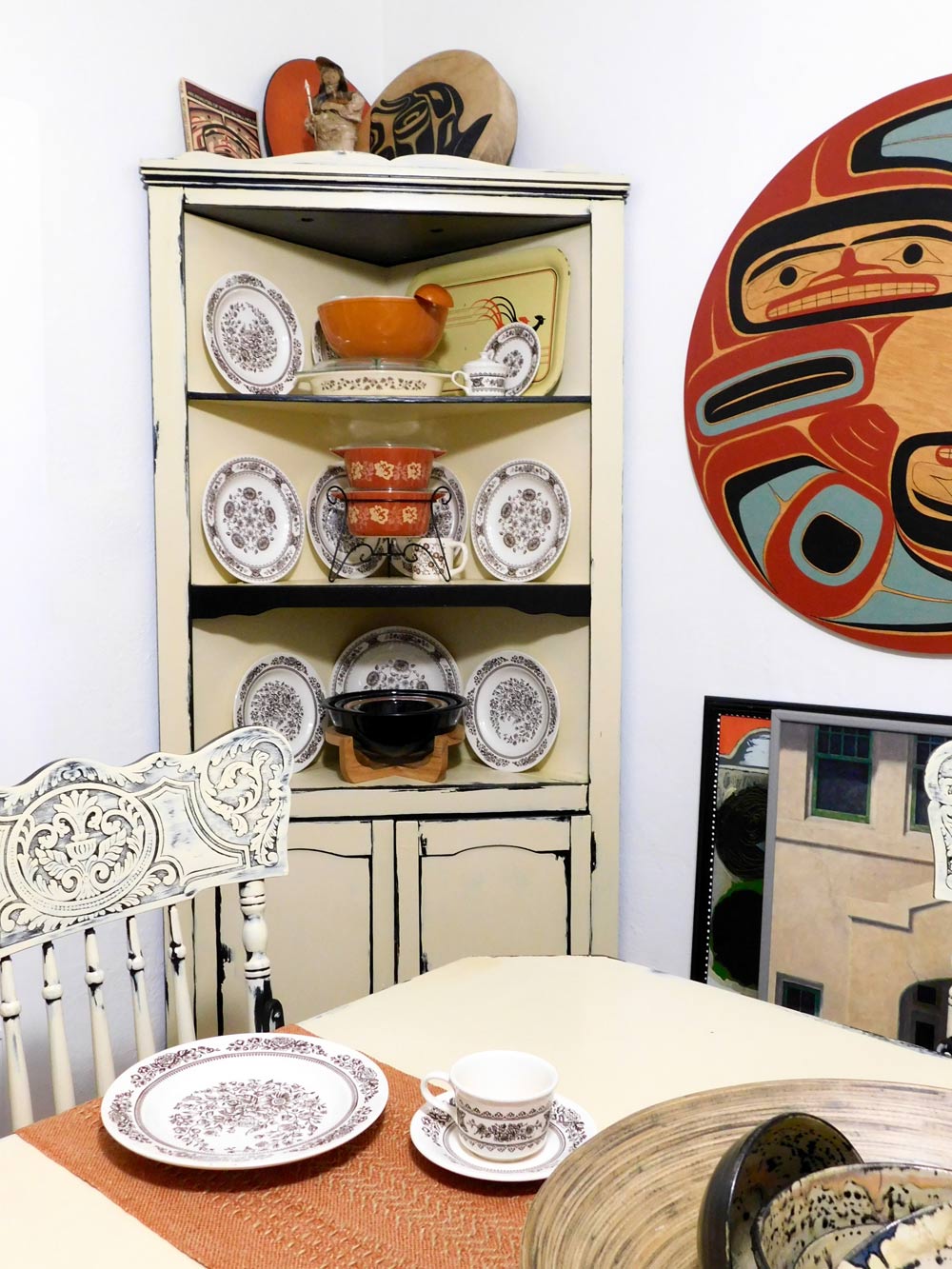
It started with a visit to Belfair’s Faith in Action Thrift Shop, where I saw a set of heavy, brick-color dishes, obnoxious yet fascinating — the same dinnerware I’d seen the month before. Apparently, month after month went by with no takers. With 14 color-study articles under my belt, I figured this might be a challenge.
 I think I heard applause as a store clerk helped me carry the boxes of 12 place settings out the door. I may have even heard the word “finally.”
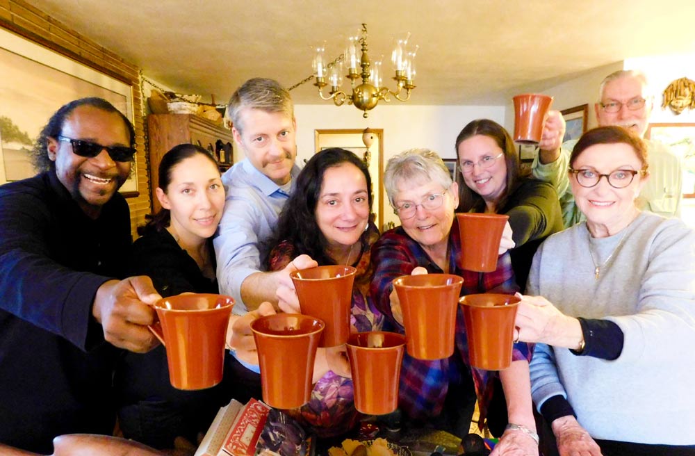
About this time, friends Joyce Merkel and Ron Gillespie invited us to a dinner party. He is famous for his elaborate, colorful gardens. And a room full of teachers would be perfect for a little opinion color-poll.
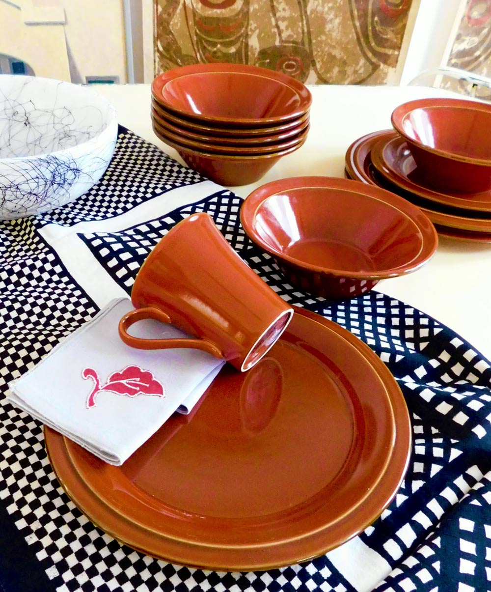
I packed up part of the set, enough burnt orange mugs for 12 people. Gave them a mug and asked them if they liked the color and whether they have it in their home.
This first opportunity to interview folks was surprising. The “let me think” turned into a “no,” but with thought, most realized they had the rust color in their homes.
 Gillespie thought of the terracotta hue as seasonal and made reference to plants such as chocolate cosmos, black dahlia and early-spring-leaf Rogeria.
I asked Facebook friends about the deep-burnt orange color. Sally Glivar, retired now after decades in the furniture business, considered the color to be rich and stately, often seen with leather sofas or recliners. She liked the brick color paired with forest-green and gold.
Arnold’s Home Furnishings in Bremerton is used to seeing me when investigating color trends. Interior designer Cate Adams is always a big help. She said teal, aqua and gray are still popular, with newer trends being emerald green and cobalt. But rust? No.
Powerhouse blue was a piece-of-cake color study. Arrogant blue, overzealous red, a-little-goes-a-long-way yellow and obnoxious-overdone primary green were colors somewhat easy to understand compared to feeling and explaining that heavy rust color that most accepted when combined with warm autumn hues.
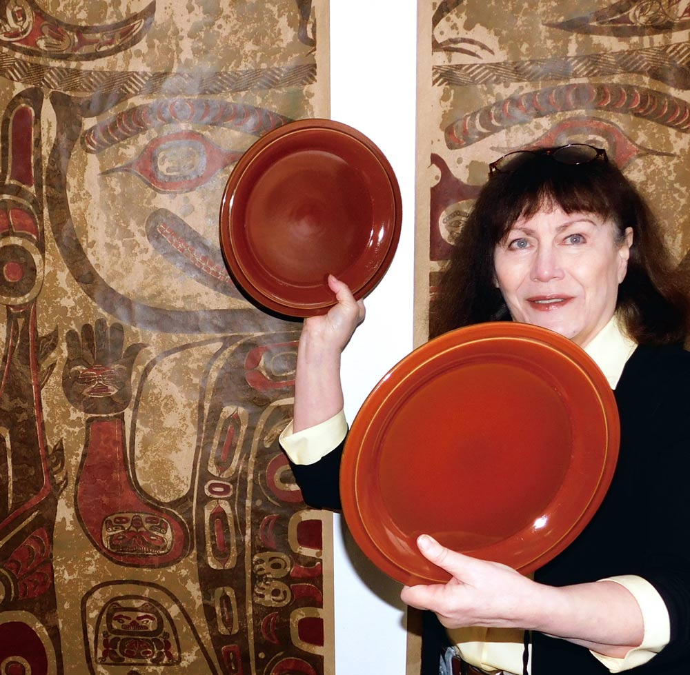
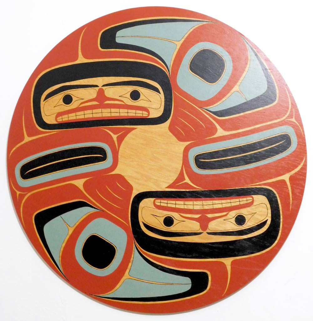
 Next stop, Zech Interiors in Belfair. Tammi Zech, who has been in the interior design biz for over 30 years, said she has worked with every color, and the deep-burnt orange-brown is most effective as an accent or is nice partnered with Northwest Coast Native American design.
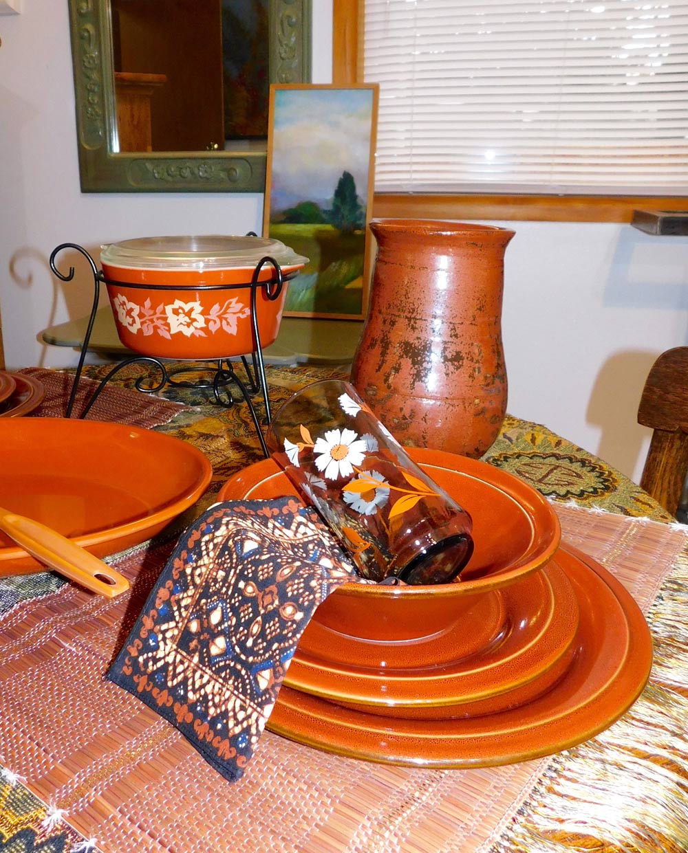
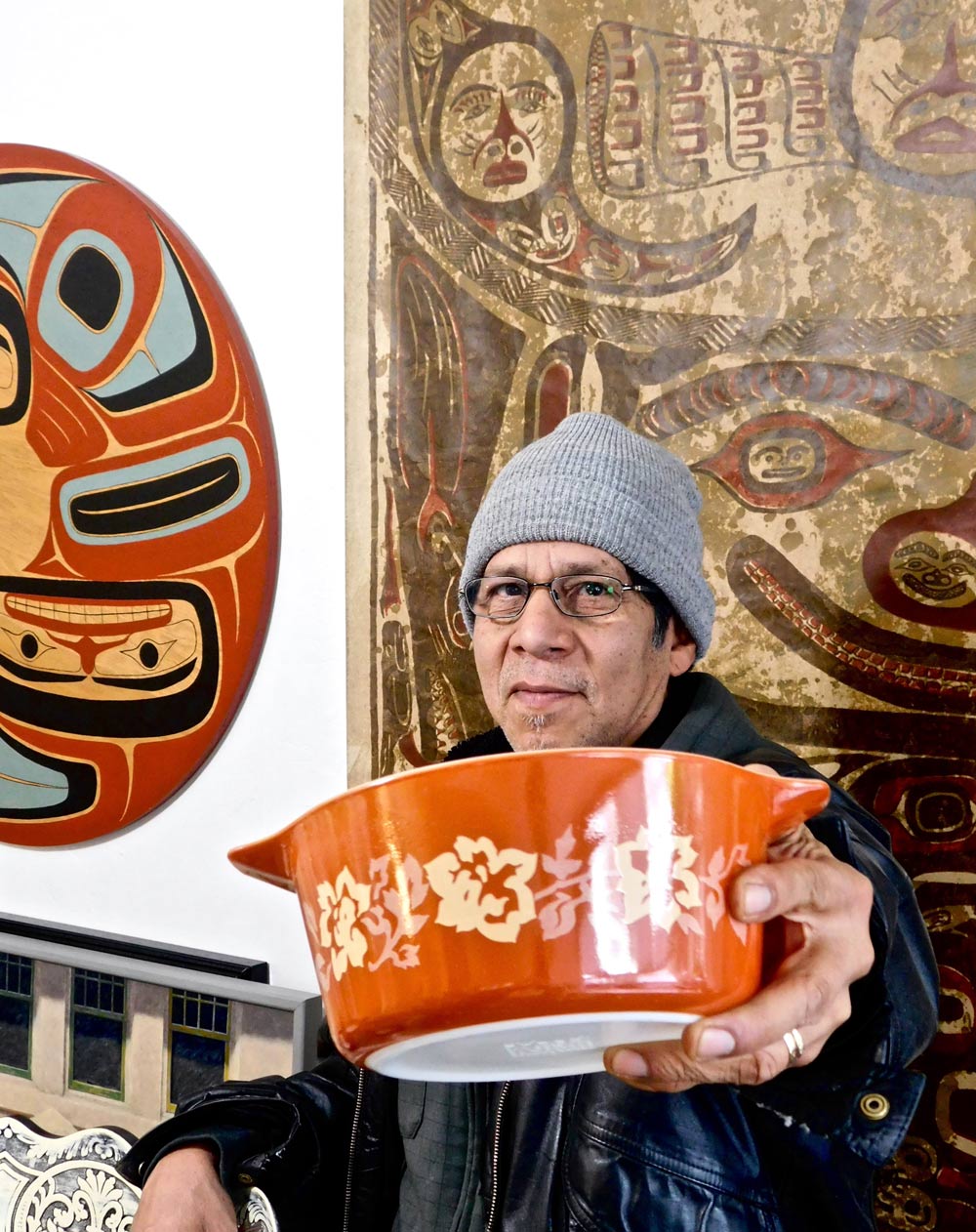
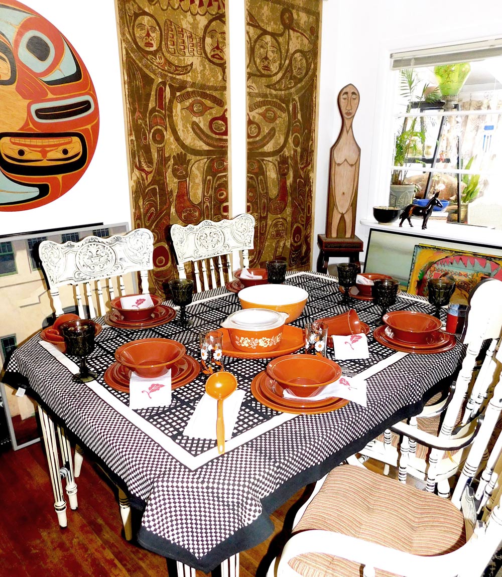
As a Northwest Coast enthusiast and collector, I felt the dark-maroon orange was a shoe-in for arranging. I gathered up other rust pieces I had — tablecloths, napkins, glasses and pottery. In my dining area of the ArtHouse are displayed large pieces by Kwakiutl totem carver chief Tony Hunt, Aleutian carver John Hoover and Gary Hartman — artists using the bolt-heavy orange-rust. It was like those rust dishes found a home, but for some reason capturing a compatible setting or theme was difficult. First I laid out a table setting for six, then four and finally dinner for two.
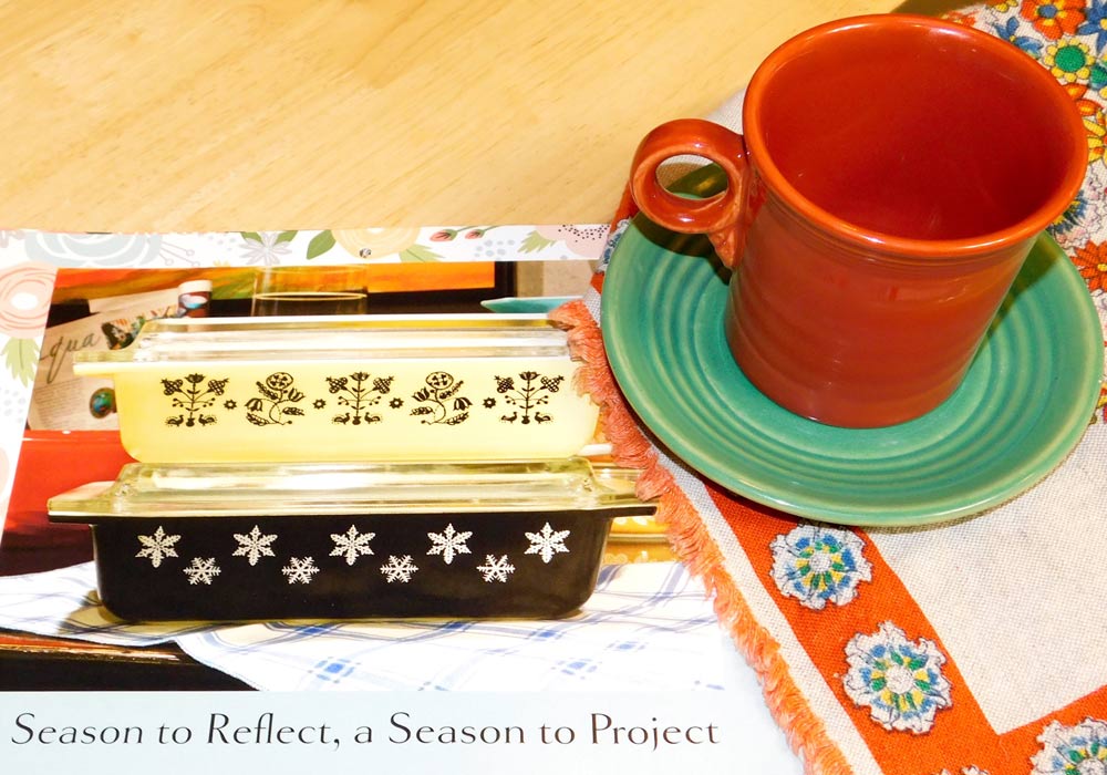
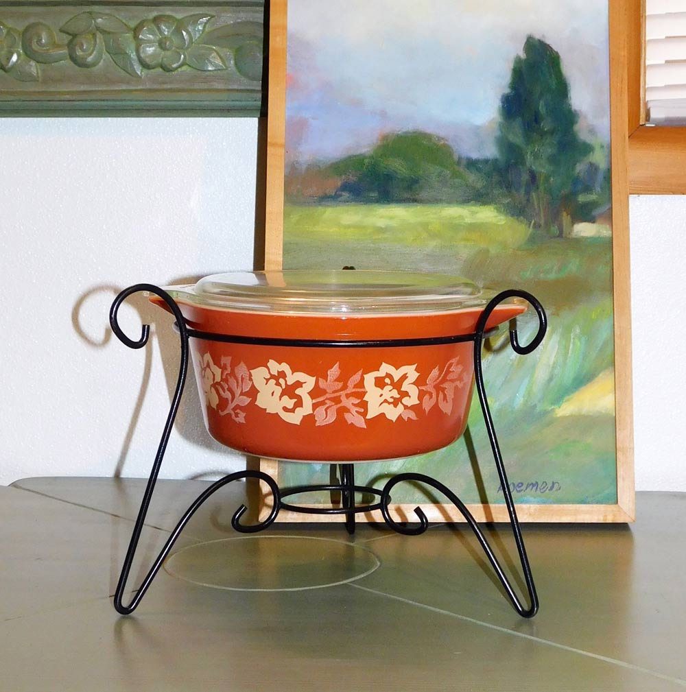
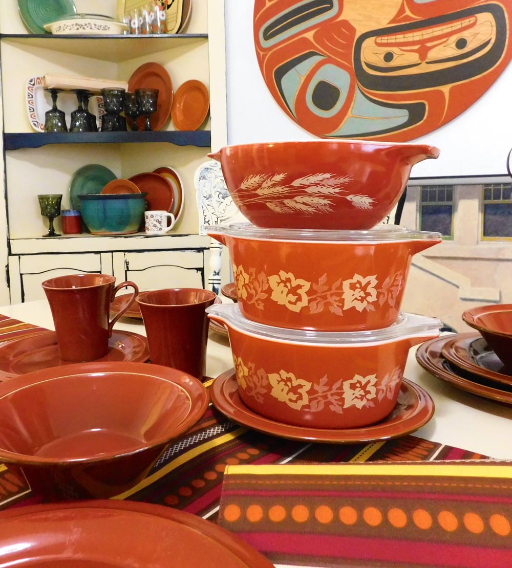
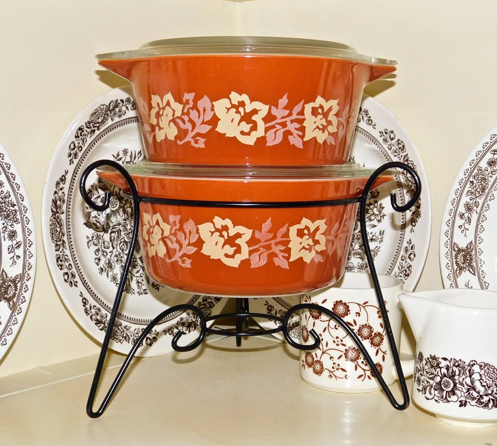 And yes, also Pyrex. In 1980, Pyrex introduced a series called “Autumn Harvest,” with two colors referred to as “orange” and “rust.” That “rust” would be my perfect reference. This is where trend makes history. In the late ’70s and early ’80s, burnt orange was hot, hot, hot — even taking the lead from avocado green. I remember back then having a burnt-orange kitchen countertop installed. Loved it then and would love it today.
To be truthful, the love of that color diminished as the three-month study wound down. Ever found yourself in a place where you wanted to ever so slowly and quietly back out and flee? The brown burnt orange that had grown on me had now become heavy and overpowering.
Back to that thrift shop, I would be redonating that obnoxious set of dishes — 48 pieces. Most working that day may not have remembered me, but my, oh my, everyone was aware of the rust dishes that they could hardly give away.
 “Can I talk to you about the color deep burnt orange and customer reaction?” I asked. It was a fun day searching the thrift shop top to bottom, but to no avail. Just couldn’t believe it; we couldn’t find the color that day, not in clothes, cookware, dishes or knickknacks. Pretty unbelievable.
“We don’t get that color in very much,” one person who prices items said.
Summing up the color, no one hated it. Half the folks I talked to had no plans to acquire or decorate with it, but then after some thought, most realized they already had the color in their décor. It is a color no one seems to notice, the always-there factor, and often used commercially.
It is a color most appreciated when partnered with another color, like with aqua, greens or seasonal fall decorations. Probably half the people that I talked to made reference to autumn, and would use the earthy hue accordingly.
Is “trendy rust” on the horizon? No. According to Pantone, we will be seeing “Live Coral,” a mauve of sorts. But don’t say the word “mauve” to oldies like me, for we’ll raise our shoulders, clinch our teeth and wince.


 Litter Free")


Comments