


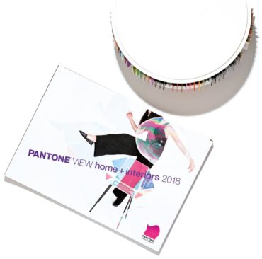
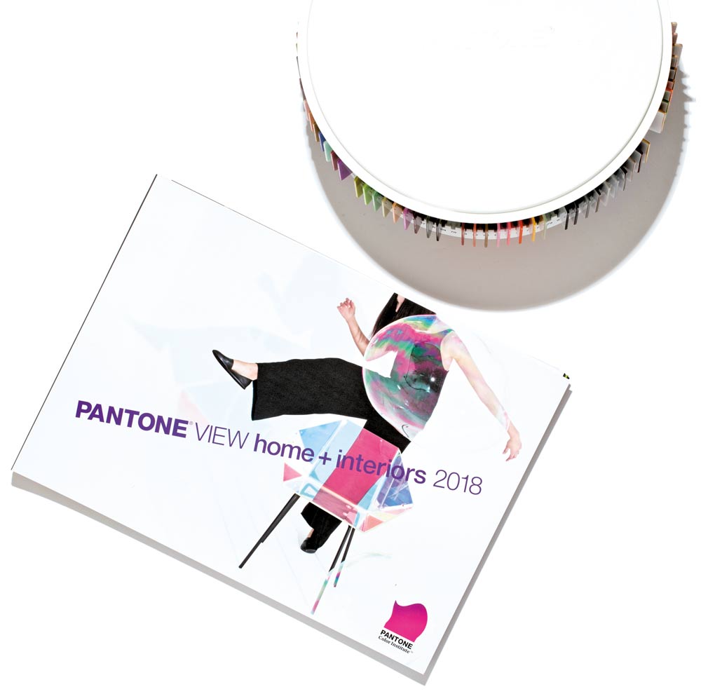
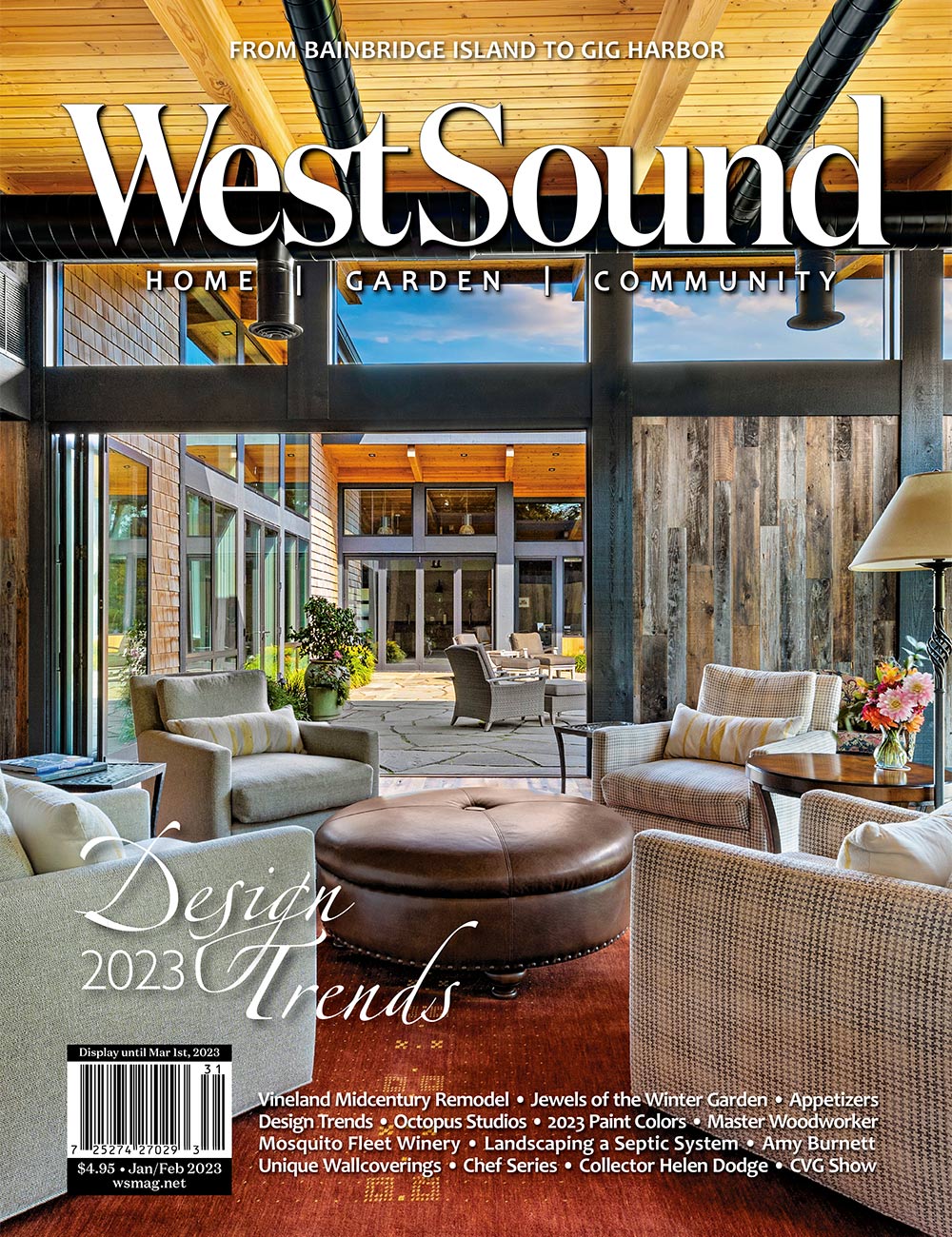
 Inspiration is the process of being emotionally stimulated to experience something that influences and encourages: an impulse, a motivator; the vital stroke of energy and movement that lifts us up and moves us forward. Turning inspiration into colorful expression almost instantaneously, social media now makes it easy to have access to original and more imaginative approaches to furnishing a home, but sometimes it is difficult to sort through all the available information. Distilling the complex universe of color into eight distinctive palettes will help you choose the color direction that will work for you.
Verdure
Verdure is all about the continuing quest for a profusion of greens from various sources that express wellbeing and are symbolic of health, abundance and vitality. An herbal tea-like tone, berry-infused purples and eggshell blue serve as foils for a variety of green-based shades with appropriate names like Celery, Foliage, Greenbrier and Treetop. Ample helpings of this palette can satisfy the public’s voracious appetite for nature’s most prolific color family.
Resourceful
The first palette, titled Resourceful, can suggest two meanings to consumers. First, there is the need to cleverly reuse, renovate and refurbish what they already own, while at the same time introduce something new and innovative to their surroundings. Leading off with one of the strongest trends in combinations is an array of blues from dazzling to dark, used with varying shades of orange including Koi, Melon and Apricot. A supportive tone of neutral, greenish-taupe called Laurel Oak completes the complementary scheme.
 Playful
The Playful palette speaks to the need for products or surroundings that are fanciful, out-of-the-ordinary and quirky. To match the mood they muster, the style and colors are more bright-hearted than light-hearted, with names like Minion Yellow, Lime Popsicle, Green Flash and adventurous blue Skydiver. They are bound to be crowd-pleasers at point of purchase in joyful and capricious combinations when used with ebullient pink, happy yellow and unexpected, hearty Guacamole.
Discretion
Low key and upscale, Discretion is a palette of subtle blends and harmonies in both color and texture. Nostalgic hues such as Elderberry, Burnished Lilac and Hawthorne Rose segue into muted, yet strengthening, tones of Blue Granite, Granite Green and a soft, mossy green, while vibrant Deep Lavender suggests a sumptuous and artful accent to the quieter shades in the grouping.
Far-Fetched
Filled with multicultural references, the Far-Fetched palette reaches deeply into the treasure trove of color sources that can render somewhat unpredictable results in a palette. The ongoing fascination for rose tones comes forth in three different shades of pink, refreshingly served up with Iced Coffee and Ruby Wine. An earthy touch is added with two terra-cotta-like shades as well as Cornsilk yellow that can be juxtaposed against cooler, grayed-blue Tourmaline.
 Intricacy

Intricacy is as much about circuitous, complex patterning and finishes as it is about comingled colors. Neutral, comfort-zone tones, including variations of gray, taupe, white and warm brown, are all a natural starting place for these dimensional designs. Functioning like shimmering new neutrals while adding visual interest is the glimmer of metallic surfacing, both warm and cool in Gilded Beige, Silver and Rich Gold. A florid Holly Berry Red and yellow Sulfur add a layer of drama to the palette.
Intensity
In the language of color, Intensity implies a certain strength, power, depth and sophistication. Inspired in part by designs of the past, this potent palette provides an eclectic mix of reinterpreted styling and color. Coolly composed shades of plum, blue and blue-green quell the fires of orange Emberglow, as well as Molten Lava and Bossa Nova, notable presence from the red family. Inca Gold, Pale Gold and Black Onyx add a stylish final touch to these intense shadings.
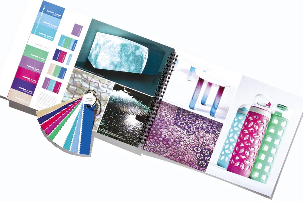
Tech-nique
The palette Tech-nique continues the color conversation with an ode to the future, featuring those hues that seem to shine from within. Fabrications are similarly perceived as futuristic, often radiating a high sheen including both crackled and clear effects, such as pearlescent, opalescent or translucent, many infused with a light-related technology. Colors include vibrant blue, green, fuchsia and purple, along with iridescent peacock tones in both turquoise and hot pink that are offset by Brilliant White and Frosted Almond.
All colors referenced are included in the Pantone fashion + Home color system. Consult current Pantone color publications for accurate color.


 Litter Free")


Comments