


 Blue is a monster — arrogant and selfish, a color that wants to call the shots and pull the trigger. It can suck the air from a room one moment and bring in the light the next. The ever-present hue can confidently stand alone or easily fit in with crowds of thousands.
Blue is part of the “primary” trio with yellow and red. That dance troupe joins up with the “secondary” colors — orange, purple and green — and the stage is set and primed for any performance, whether that stage be a summer garden or a city storefront. This is the starting point of defining blue, as a headline performer that expects to be that frontline aggressor.
 I am talking about bright, vivid, deep blues like cobalt, ultramarine, primary and what some refer to as true-blue, not the softer tones muddled with greens, whites and extended saturations.
The very light blues warmed with a touch of yellow make up a soft hue that contributes to calm and serenity in hospitals, schools or the like, whereas a hospital hall with bright-cobalt walls would be offensive to serenity.
 In the opposite direction, take ultramarine blue and add a little black with a touch of white and you have that popular, colonial-type blue that is deep in tone but not offensive. Darkening the vividness affirms comfort.
A not-so-comfortable backdrop is the arrogant bright blue that is seen on the majority of television backdrops and sets. Media sets love blue, absolutely love the stability that accentuates and presents the intended focus. Also notice billboards and signs.
An interesting comparison is red, a primary color you may think of being aggressively dominant. It is, and is often used in restaurants as an appetite enhancer, but flamboyant red is still a side-chute to blue.
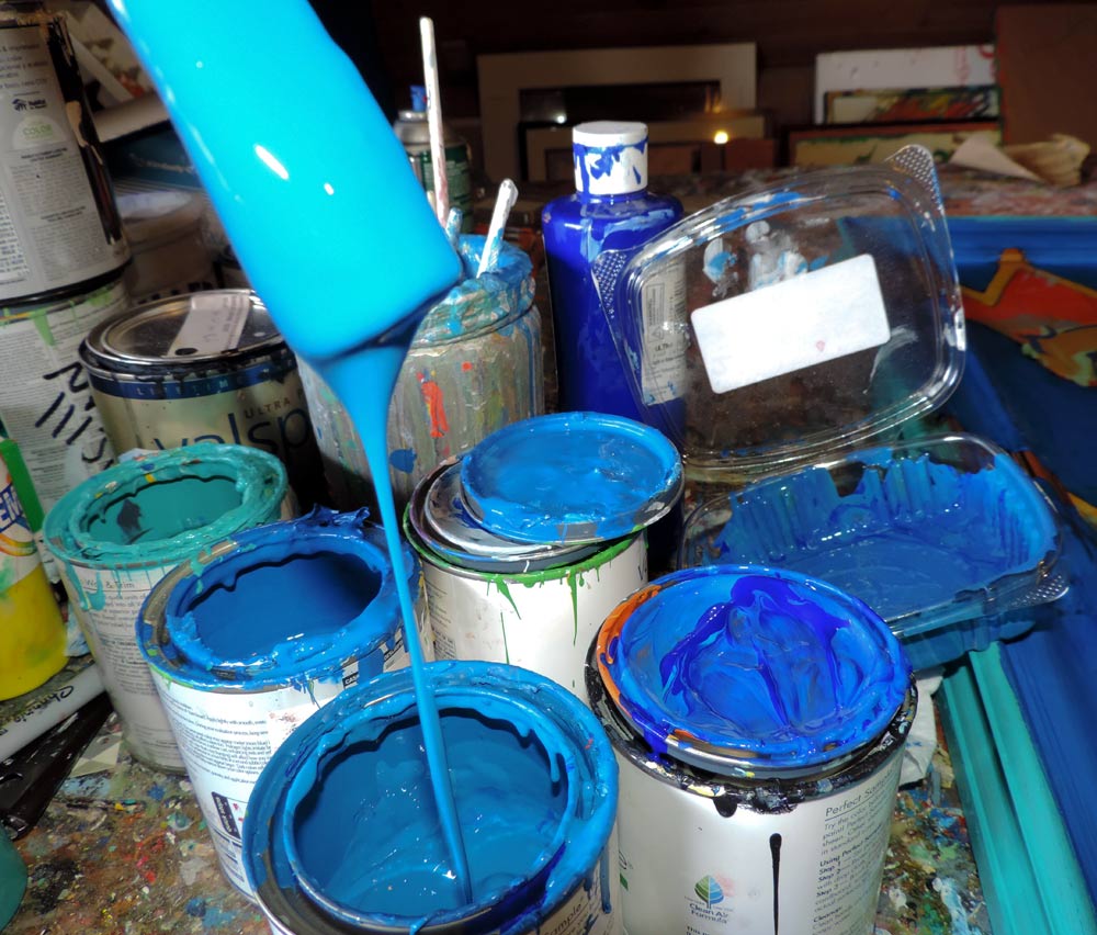
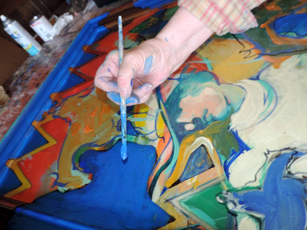
 A study ensued. I bought a gallon of blue paint to create blue paintings, began interviewing those entities involved with the subject, and even asked an artist to write a blue poem.
Local artist Jennifer Chamberlin wrote a poem called “A Blue Haiku”.
Asking about blue, one friend said, “Oh, my garden is loaded with blue” but on further discussion, she said, “I guess I mean purple.”
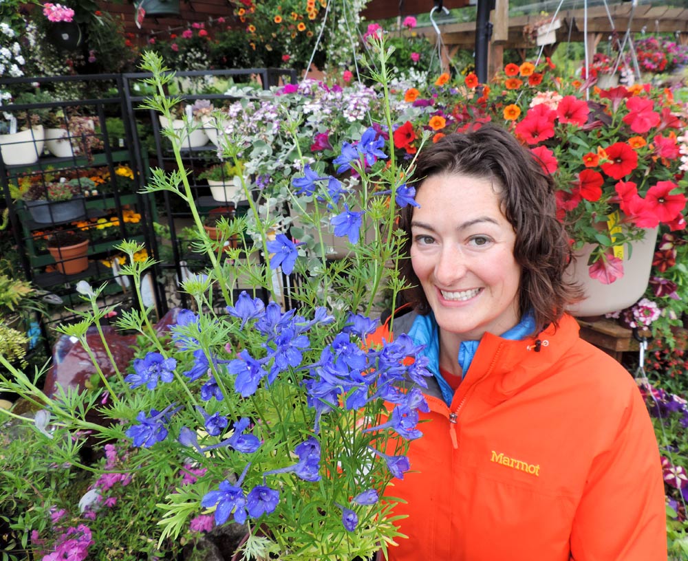
To further investigate garden-blue, I went to Bremerton City Nursery, a very busy place. Colors everywhere — but very little true blue. Crystal Voorhees was happy to direct me to sweet, blue flowers called blue butterfly delphinium.
 It was the same at Arnold’s Home Furnishings in Bremerton. Design consultant Colleen Foust walked me around the elegant showrooms, and anything in the ultramarine-blue category was missing. “Weren’t there cobalt leather Swedish chairs here at one time?” I asked, but it seemed no.
But alas, I found that famous, aggressive, arrogant blue at Car Town on Auto Center Way in Bremerton.
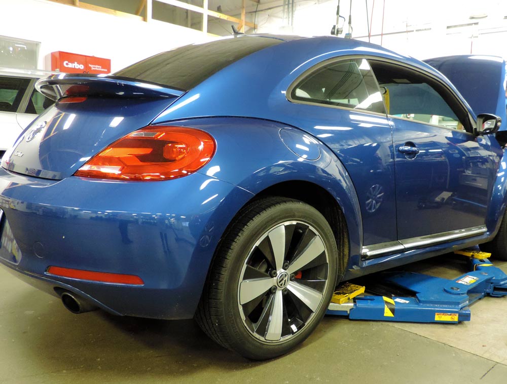
 At this point I did not know what to expect. I bought my Passat at Hazelwood, so went there to see friendly faces, and ask Lourie Mellick about blue cars. She got excited and immediately took me to the area where folks were working on this fabulous, blue Volkswagen Beetle. It was so blue and beautiful.
I drove around to other dealerships and came to the conclusion that there may not be a lot of blue sofas but blue vehicles are popular.
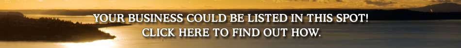
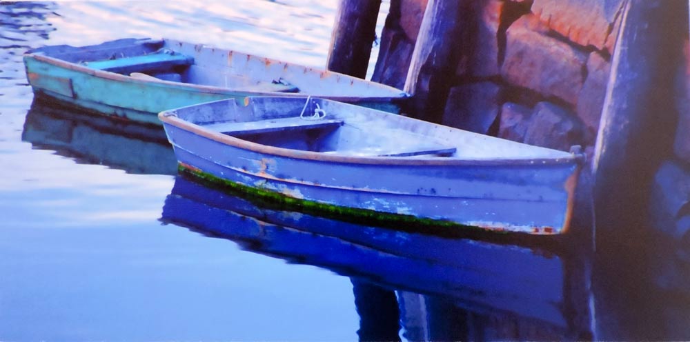
Bremerton has a gallery walk every Friday of every month and on this particular Friday I asked folks to wear blue, making blue the feature for Amy Burnett Gallery. Glen Wilkerson was the guest photographer with vibrant, blue-water and boat-theme photographs.
 At the Bremerton Gallery Walk, I presented a new exhibit of six blue paintings. Having all these degrees in art and gallery showings, I had never concentrated on “true blue.” The experience was enlightening.
At first, the challenge was very difficult but soon this arrogant hue captivated my imagination; blue paint was flying everywhere. I was even taking old paintings, applying vivid blue and refocusing themes. The “blue study” was turning out to be a very fun experience.
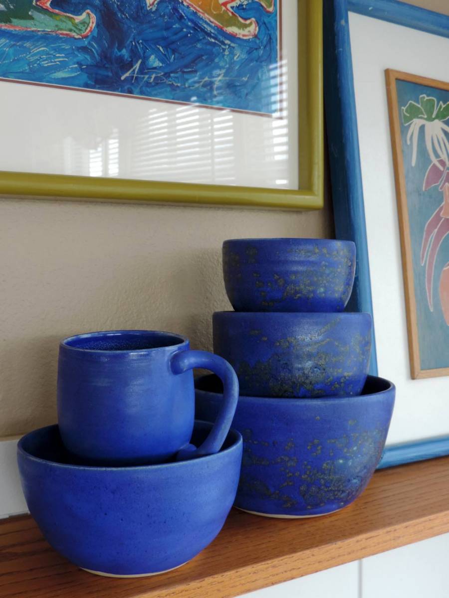
Having had the Pyrex Museum and a mid-century kitchen connection, I found the color blue to be historically family-friendly. It is a color that makes a kitchen or any other room pop. Because vibrant blue is so aggressive, quantity should be limited.
 In 1972, the Beetles broke up, the Vietnam War ended and Pyrex introduced the superfamous and popular gold-and-avocado-green dishes and cookware. “Snowflake Blue” was also introduced that year and produced until 1975 but it never received the notoriety as gold and green.
Bright, deep-ultramarine blue is absolutely wonderful. Even a few pieces in the kitchen can add wonder, excitement and drama. As I scoured thrift shops looking for midcentury modern kitchenware, I sometimes ran into blue kitchenware and glass. Each time, the color seems to challenge me, as if it is smarter than me.
 This vibrant, deep blue is smarter than me, or that is what it tells me. It is “that blue” after all — arrogant and self-serving and yes, a royal color.
But that blue that dominates the scene and the sky and feels it deserves all notoriety — it also serves best and most-deserved when the stage is filled with actors of every color.
Blue, you are a monster, but as a monster, you quiver with delight with dancing partners that help enhance the scene and make gayety and significance of performance.


 Litter Free")


Comments