


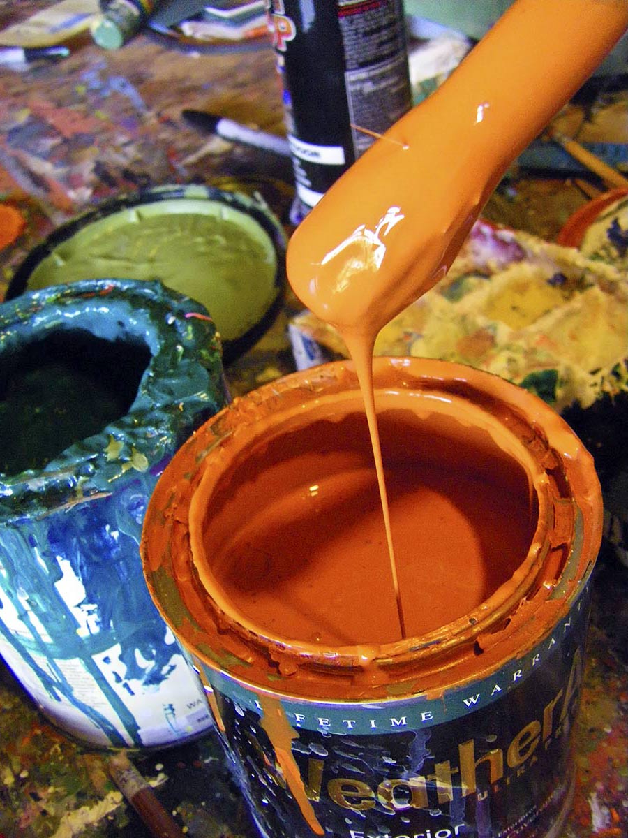
 Not the second stage of the color wheel, but that backseat color you pay less mind to; the color that happened to be there, a whim decision, the jovial hue of gathered gadgets or the color one did not chose.
Not to say that you do not like that color, it just happened.
Most find that something unexpected will inevitably come into their lives. It may be a chair — “gotta have it” even if goes with nothing in the living environment. Or maybe you inherited a big, flamboyant painting from a dear relative that has left you wide-eyed and bewildered. Or there is a new color trend you love, but it has no connection with your house.
Then there is my favorite dilemma: when after much input, consideration and money, the chosen color that has been used is hated and is far from the well-intended aspiration.
The remedy is deep breathing and a bit of applied tolerance. An experienced designer can take your hand, act as guide and most often make clients happy. But the do-it-yourself risk-taking can be a fun adventure.
 First, buying an odd color, out-of-place lamp, area rug, chair or so on — try going with it, accept your decision. There must have been some reason.
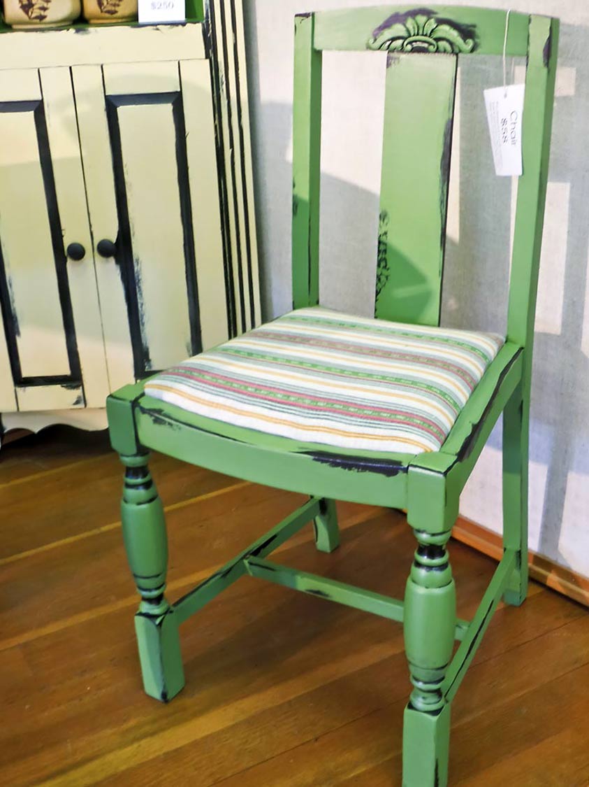
 For instance, a bright, lime-green upholstered chair that matches nothing and can’t be taken back to the store. Normally, as someone who deals with composition, I would analyze the living space to be designed, maybe deciding where to pick up that color in other areas. But in this case, no. Don’t accentuate and further the misgiving. Stage the chair somewhat out of traffic areas; provide cozy lighting and a small side table holding a good book. And, voilá! — there is an exciting, purposeful visual retreat, as if an intended plan. Have fun, and don’t add to the situation; you may enjoy it or get rid of it later.
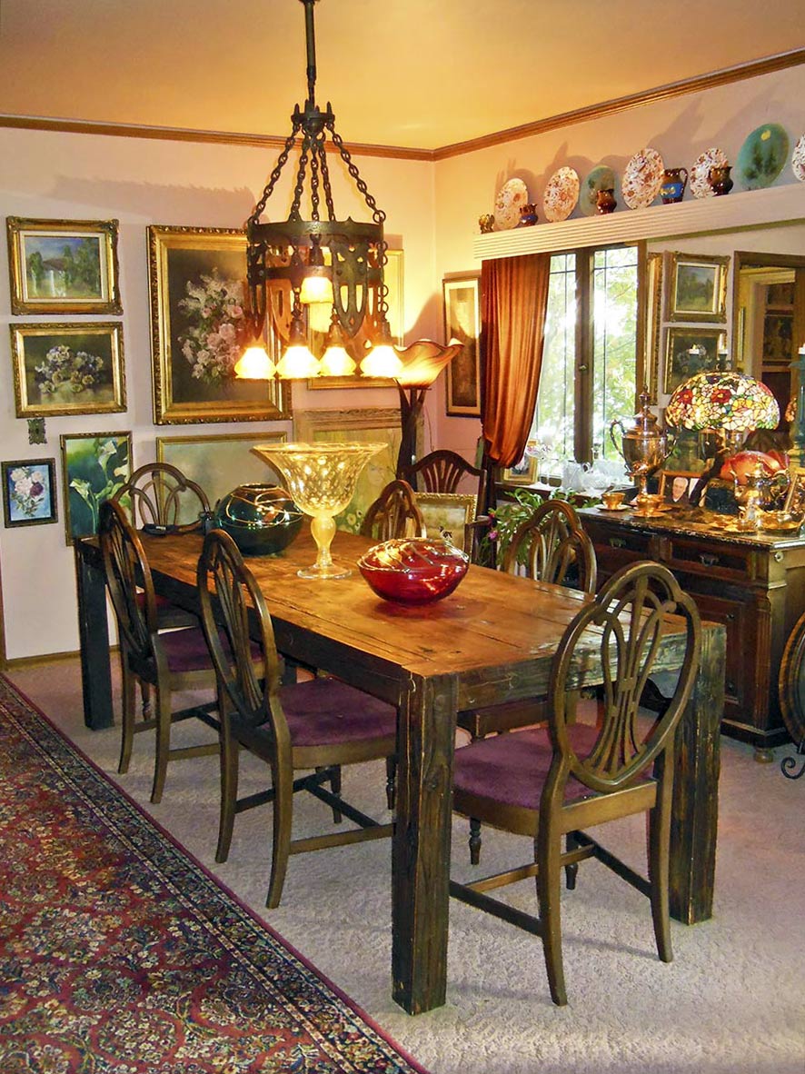
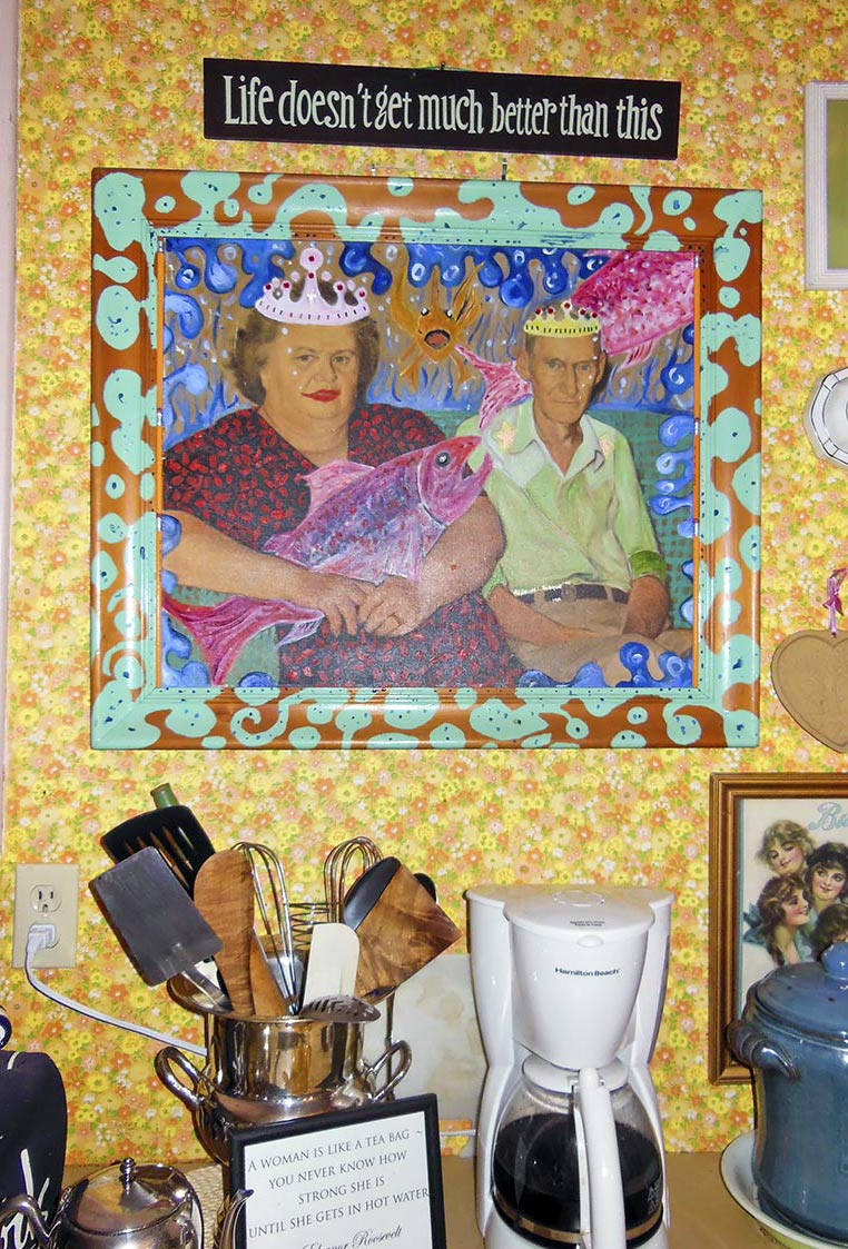
 That inherited painting, oh my! Welcome to my art gallery world, where folks call regularly on that subject because size, style or color just don’t fit. Aunt Sarah’s hobby should not be your décor obligation. A gift to you can be a donation for a good cause — in Aunt Sarah’s name, let’s say.
Acquiring a painting that is very valuable or by a famous artist is another story where investment and statement enter the picture. I suggest working with the situation to create a positive. Make the piece a visual statement by not cluttering things around it. Hang it in a nicely lit area, and unlike the lime-green chair, do pick up similar textures and colors in other areas of the room. This will create a softer flow. It might be as simple as having an aqua throw pillow or vase in the same room to complement the aqua in the painting or a patterned textile throw, as might be in the art.
Yes, a purist wants art to stand alone, but accepting art you didn’t ask for and you don’t necessarily like may need “tolerating design” help from a professional. Or as one friend did, put the priceless, hideous art in a seldomly used area of the house.
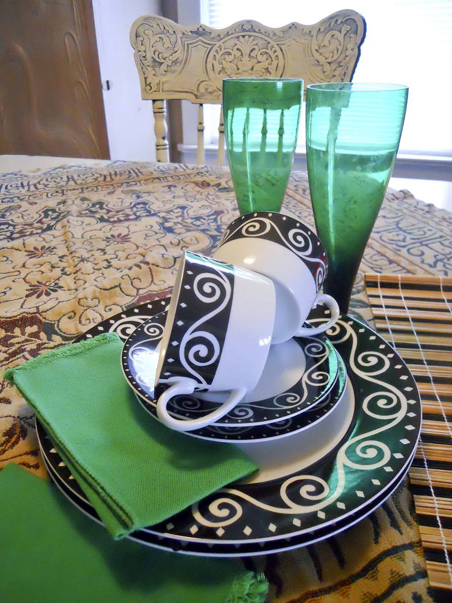
 Then there are colors that seem to pop up from nowhere, the scatter rugs found in the basement, the couldn’t-pass-up-sale or the rummage sale kitchen chairs finds. These come-by colors become secondary considerations.
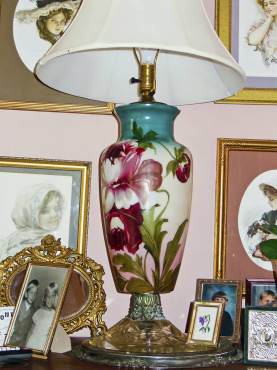 My story began with an extensive set of “Butterfly Gold” Corelle dishes that were left in a rental. I put them for sale in the Pyrex Museum retail area, but no takers. If I left them outside on the sidewalk overnight, no one would take them. So I brought them home, and my husband immediately fell in love. Those easy-care, easy-use, light gems were not leaving the house.
Soon, I picked up matching mixing bowls in gold color, coffee mugs and yellow accessories. This became my secondary kitchen color next to my deep, primary blue. No, I would not have chosen the yellow gold color. It happened, I accepted, and it is a lovely combination.
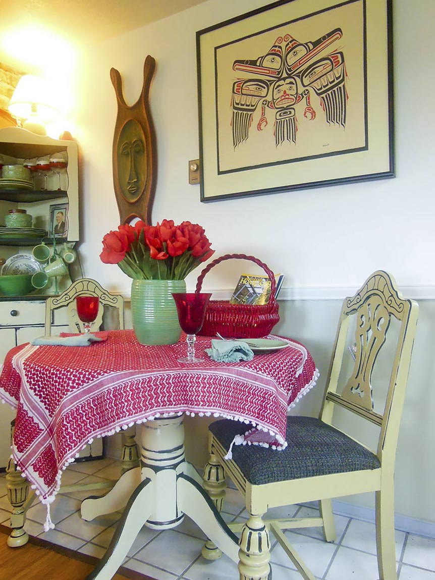
 What if you hate it? It was the latest trend last year, so you introduced it with your home décor and bought new furniture. Now, the black leather is depressing and overpowering. The light-blue, new carpeting is too cool. The mustard-yellow walls are too yellow. The red kitchen floors clash with the new, open-shelf concept. The new sets of bright, ornate dishes look horrible in a food setting, and blond end tables seem out of place with the oak coffee table.
 In most cases, these are secondary decisions, whether intentional or by happenstance. Color is generally an agreeable entity that likes a secondary partner.
Yellow and green are good examples. Yellow alone is monstrous. I am talking about primary yellow. Yet partnered with other colors, it becomes a star that shines. Primary green alone is very intense and heavy, but if it has a “primary” or is a “primary,” the color becomes friendly.
Even blue and red that happily march alone can find significance with secondary partners. We live with colors, in a world that says “never-say-never.”


 Litter Free")


Comments