


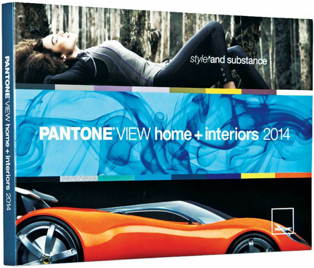
 In this complex and information-laden world, there is a multiplicity of resources that inform color and design directions. More than ever before, it is important to be aware of future trends as consumers are seeking distinctive styling and considerable substance. Most importantly, colors and combinations must be appealing, evocative, transformative and “on-target.” The following nine themes explain the major trends and the sources of inspiration.
Techno Color
Innovative Techno Color acknowledges the advancement of technology and how it is impacting the world of design and expanding the color universe through a melding of both vibrant and deep hues frequently executed in reflective surfaces. Shades like faceted Emerald and a turquoise-like blue, an exuberant orange and strong, vital purple plus a true blue, Jet Black and Dark Citron are intertwined in intriguingly inventive color combinations.
Physicality
As the name implies, Physicality speaks to the colors of power and energy counter-balanced by the presence of the hues that express the necessity for introspection and calm. The stamina of Forged Iron, a Satellite gray, Antique Moss and Gothic Olive, are interplayed against the healing shades of an herbal lavender, a grayed grape, a rosy brown and a quieting, ephemeral foggy gray, all presenting a challenging, yet invigorating, game change.
 Sculpted Simplicity
Sculpted Simplicity recognizes shape, form and structure and how important they are to the end product and environment. Colors are unassuming and do not take center stage — they are sophisticated tones with distinctively nuanced undertones that are elegantly harmonized including Travertine, Anthracite, Blanc de Blanc and Twilight Mauve, supported by an anodized brown, ethereal gray and a suggestion of silver.
Fluidity
Gliding gracefully through watery channels, Fluidity is the palette that understands the inevitable human need for life-sustaining, cool water tones rendered largely in dazzling blues and blue-greens. These cooling hues are underscored by shimmering seagrass shades and undersea-creature colors such as Absinthe Green, Violet Tulle, a blazing Samoan Sun, a Dewberry purple and two tones of eye-arresting orange-corals.
Collage
Collage is a gathering place for found objects that are well worn and somewhat nostalgic — a charming mélange of artfully constructed designs that demonstrate ingenuity and resourcefulness. There is poignancy in this palette, with color and design sounding a familiar chord. Tea Rose and deep reddish Rhubarb, warm Pumpkin Spice and cozy Sheepskin are refreshed with Margarita green, Provincial Blue, plus cascading tones of aqua and teal.
Intimacy
Intimacy implies a certain affinity and relationship that are expressed in tints and tones that are inviting in nature and softly tactile, closely connected, yet subtly different; a happy marriage of adaptable warm, cool and neutral tones. Combinations co-join effortlessly in offering an understated color collection. Gardenia white defines a lotus blossom pink; Rose Cloud, Fawn and Café Crème are delicious together, while pale Lavenders and Opal Gray are effectively approachable.
Moda
Both svelte and voluptuous, Moda speaks of attention to detail and the drama of high fashion when translated into interiors. Combinations can be theatrical in nature, displaying fashionable or whimsical flourishes, but always done with tasteful finesse. Red Dahlia interacts with Blackberry Cordial and Wood Violet, all accented by a yellowed Amber Green. Corsican Blue meets with Magenta Haze and an expressive Linden Green, while Rich Gold waits in the wings for the appropriate moment to add a glimmering finale to any of the combinations.
Tribal Threads
We are all members of tribes whether through cultural background, religion, political affiliation or community. The colors in this palette are as varied as the tribal diversity they represent, yet they construct a universal linkage of artistic appreciation rooted in personal expression. Color combinations may be disarmingly simple or as complex as inter-woven threads. Neutrals such as Bleached Sand and Kangaroo brown highlight an exotic Arabesque burnt orange, while Goblin Blue is flavored by Curry and Peppercorn. A rose-dusted cedar shade is set off by taupe-toned Incense.
Eccentricities
There is always room for an eccentric palette with a personality that defies the established “rule book” of design and color, bringing with it a sense of adventure, wit, experimentation and discovery. It’s “tongue in cheek” in attitude and highly original in color juxtapositioning and cleverly conceived in evocative combinations — a flash of neon green radiates off zesty lemon or nectarine combines with a daredevil Skydiver blue. Fudgesickle brown is rendered sweeter with Strawberry Ice. A warm red coexists with its cooler counterpart, while black and/or white can be drawn into any combination.


 Litter Free")


Comments