


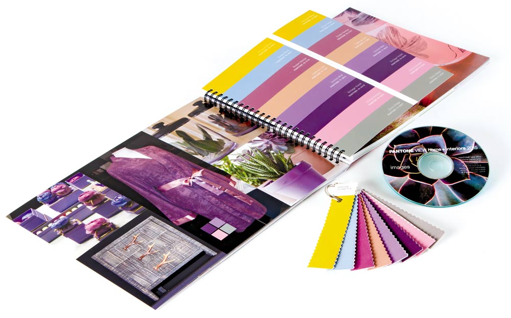
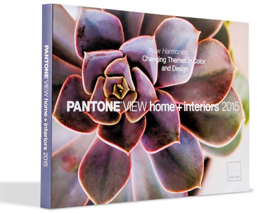
 For most consumers today, color and style coordination in home interiors is a consistent goal, but the old, rigid color rules have been replaced by more creative guidelines and options. Lifestyle patterns and tastes are consistently evolving and so are the resulting forecasts that are spawning new harmonies in both color and design. The following descriptions include the strongest trends in color and styling families.
Style-Settings
As high fashion is often a forerunner to styling for home furnishings in line, design, texture and color, the taste-making palette called Style-Settings is all about poise, finesse and polish. The elegance of the purple family adds a dramatic interplay against the classic mahoganies, off-whites, grays and taupes, along with subtly shimmering Frosted Almond and Champagne Beige.
Abstractions
Abstractions releases the inner artist in each of us. Just as in the formulation of abstract art, styling might seem randomly gathered, forming a mosaic of differing shapes, many of them geometric. Colors like grape and apricot, dahlia red, stonewashed blue, hazel nut brown and vineyard green seem to come from equally disparate places, but when brought together create an artistic whole.
Botanicum
Botanicum is a palette lifted directly from the complexities of flora and foliage, forming intriguing groupings filled with succulent shadings of green and grape, and café au lait, most often counter-balanced with dusty or smoky tones of blue and orchid. When used together, a sophisticated, yet inherently natural palette emerges.
 Zensations
The palette titled Zensations truly engages and heightens the senses as it displays a literal “enlightenment” by taking the thoughtful, meditative qualities of the blue and blue-green family to another more visceral level by adding to the palette a compelling red, an atmospheric green as well as sparkling silver and gold.
Urban Jungle
An Urban Jungle transforms rustic chaos into something “civilized” and sylvan, speaking more of big-city living than that of a wild terrain. Rather than consistently rough textured, contours are smoother and colors a combination of both typical and atypical jungle hues. Warm animal skin tones are set against the modernity of deep blue-greens, a vibrant greenish yellow, plus black and white.
Tinted Medley
Tinted Medley is truly a harmonious composition of closely related, deliciously warm tones with peach and pink striking the main chord. Bellini, Apricot Wash, Peach Amber and Macadamia are compatible blends while powdered roses and yellows underscore and support the perfect pitch of an ethereal rosy-taupe.
Past Traces
Past Traces honors history in the home as, for many of us, holding on to some vestige of the past is deeply satisfying and reassuring. The look might range from gently worn to contemporized adaptations, still many of the colors with names like Pastel Parchment, Cameo Green, Faded Denim and Dusty Cedar capture a vintage feel.
Serendipity
The literal meaning of Serendipity is “a pleasant surprise” or “a happy accident.” In the parlance of styling, it is the coming together of unlikely designs and unexpected colors. An outgoing orange engages cool eggshell blue, bright chartreuse is enhanced by a yellow gold and hot pink embraces a lofty scarlet, all under the watchful gaze of a Tiger’s Eye taupe.
Spontaneity
Irrepressible fun is what this palette called Spontaneity delivers. Just as the name implies, it is the stuff that spur of the moment, impulse buying is all about, with whimsical design and a unique “mash-up” of color mixtures a large part of the attraction. Happy hues of Sunkist Coral, Marigold and delicious Cantaloupe are complemented by the exuberance of Kelly Green and/or “quieted down” with floral accents of Hyacinth, Violet Quartz, Winsome Orchid or Misty Jade.


 Litter Free")


Comments